
Ask Chris
Stock Footage for Video
Stock footage has a place in video, but it isn’t a cure-all. Use it wisely!
Stock footage has a place in video, but it isn’t a cure-all. Use it wisely!

Close more sales by adding video to your proposals
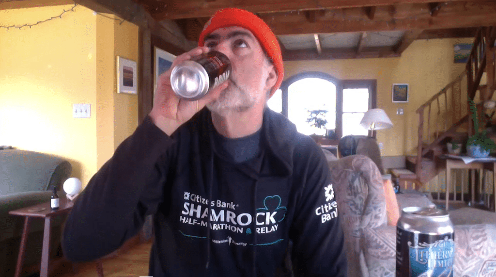
It’s never been easier to shoot good, quality video. And a lot of people are shooting their own video. We put together a few tips
All of our face-to-face meetings have gone online. How can you make the most of this virtual situation?
Animation is a powerful tool. How can you use it to get the most out of your communications?
We’ve learned a lot about communications over the years, but we recently learned some valuable lessons after we looked at some of our social media
Your staff is made up of people with years of experience in their field. Whether you know it or not, you work with a team
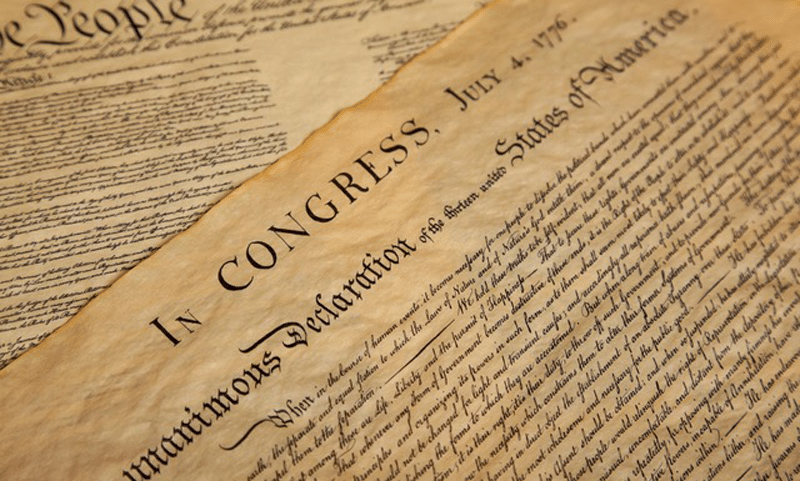
Life, liberty and the pursuit of happiness. As July 4th approaches, you’ll probably hear this phrase a few times. Why does this phrase stand out? Historically,
